You may know us for our nightmare-inducing web art, like “Doobie de Blasio,” “Candy Cuomo” or “Birdy Bezos,” but we’re damn proud of our magazine covers too, which we use to pull unsuspecting observers into the world of New York politics each week. We picked some of our favorites from the 49 issues this year, and got some comments from our in-house virtuoso, City & State Art Director Andrew Horton.
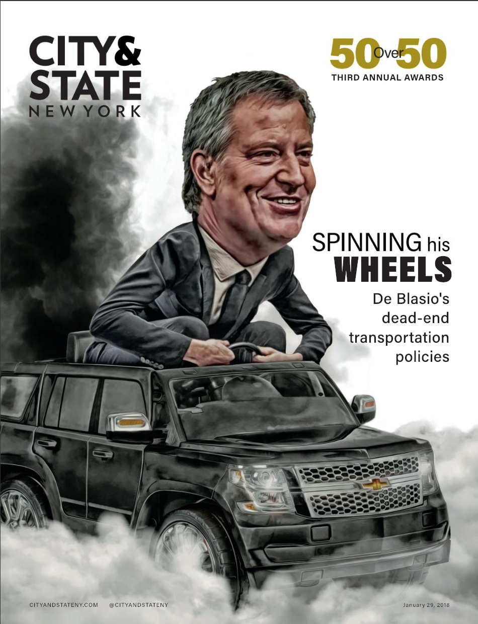
If you want an incredible, impossible, photorealistic illustration, Javier Muñoz Fernández is your man. De Blasio driving the SUV spoke to a central annoyance of his mayoralty, and now hangs in a place of honor in Room 9, home of the City Hall press corps.
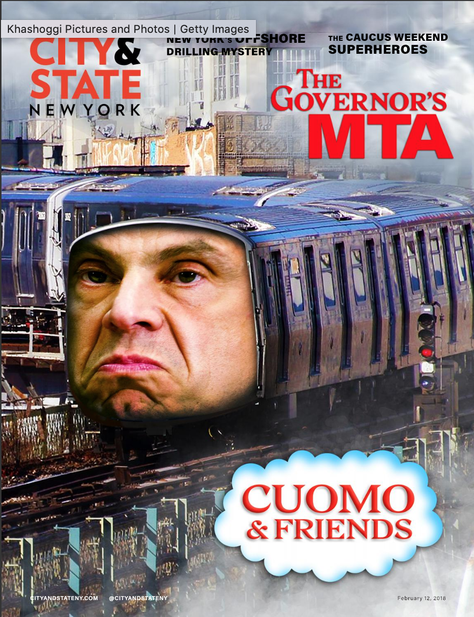
“It falls within the grand tradition of political cartooning in New York, going back to the days of Thomas Nast and Tammany Hall,” said Horton, praising the cover by his predecessor, former creative director Guillaume Federighi. “It’s certainly within our remit to allow the governor to look ridiculous at times.”

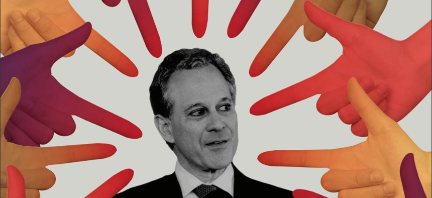
“The Schneiderman cover was my first (at City & State), and I love that I got to do a news-focused cover for my first one,” Horton said. “I think that it pretty much captures the position that the establishment has found themselves in in this current political moment.”
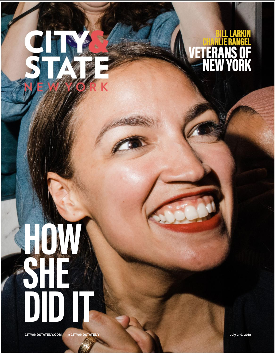
“It just captured a moment. For not only the city and state, but also the nation, of a surprising power player’s rise,” Horton said. “The lighting is great. That’s the moment she clinched her victory, and it just really speaks to the energy that her campaign brought to that particular election.”
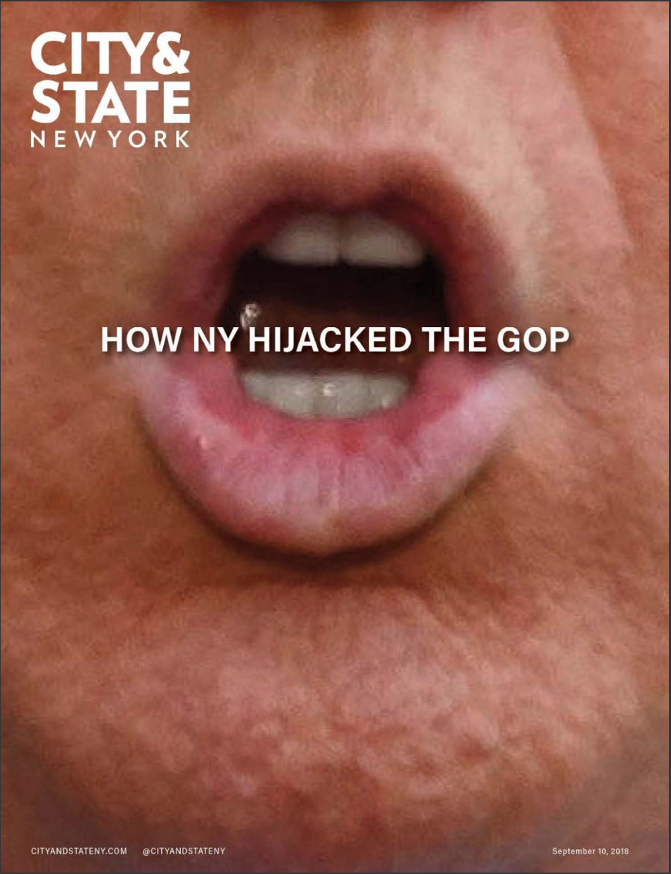
“I’m haunted by that cover. At the same time I love it,” Horton said. “It’s all I see when I look at Trump. His puckered orifice.”
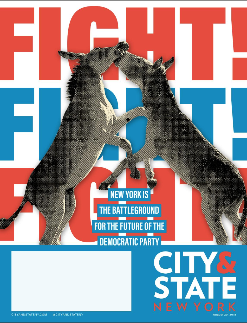
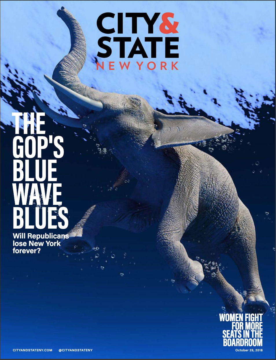
“I’ll group the ass and the elephant together,” Horton explained. “Because despite what W.C. Fields said, it’s always good to work with animals and children on magazine covers.”
NEXT STORY: The best New York political journalism of 2018

