In the fall of 2018, New York City Transit said that it was turning a corner on subway performance – and in a way, it’s not wrong. At the end of 2018, subways were on a streak of four straight months of reduced delays, with the share of trains that arrive on time hitting a four-year high in December.
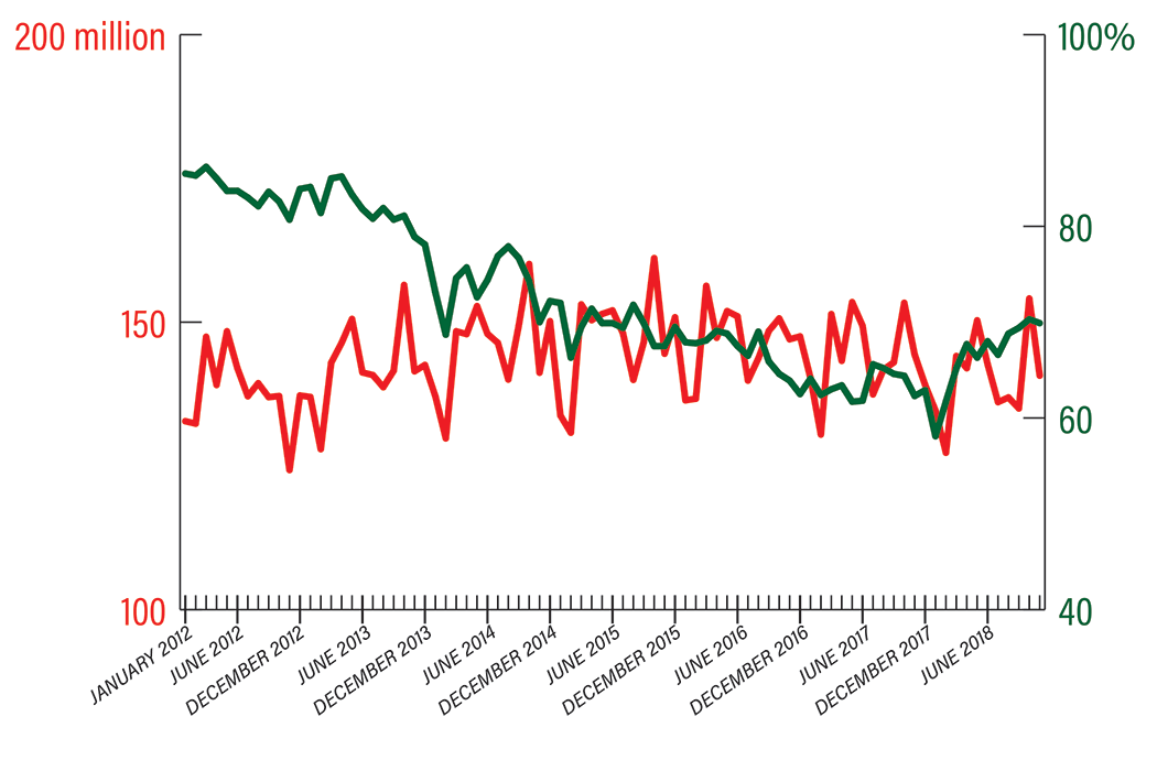
But if anyone who has lived in New York for more than a few years has trouble believing that upward trend, it might be because when we take a longer view of history (really as recently as 2012), it’s clear that on many metrics, subway performance is still below where it was six or seven years ago. We threw together this graph to provide context for just how much subway service is improving – and how ridership has fluctuated at the same time.
The Metropolitan Transportation Authority provides comprehensive data on performance metrics for the subways. One of those metrics gets to the heart of what many daily subway riders experience: late trains. The MTA uses on-time performance to measure the share of trains that arrive early, on time, or no more than five minutes late. Monthly ridership figures represent the number of passengers from whom the MTA receives a fare or fare reimbursements.
At the beginning of 2012, weekday on-time performance was 85.5 percent, and six years later in January 2018 it hit a low of 58.1 percent. The most recent figure showed that on-time performance rose to 72.6 percent in December 2018.

Fast Facts
MAJOR DISRUPTIONS
January 2015: 74
January 2018: 105
ON-TIME PERFORMANCE (December 2018)
Worst: F line, 42.9 percent
Best: L line, 90 percent
WEEKDAY DELAYS
November 2012: 22,240
January 2018: 76,287
MEAN DISTANCE BETWEEN FAILURES*
December 2012: 174,687 miles
December 2018: 121,116 miles
* How many miles a subway car travels before a repair needs to be made. (The MTA has actually made progress here – in 1982, the average subway car traveled only 7,145 miles before requiring repairs.)
NEXT STORY: How to get riders back on the bus


